
Scatter plots are used all the time for research in science, math, and other disciplines. So, it helps to have a good sense of what they are used for and what they tell us about a data set.
So, what is a scatter plot used for? A scatter plot is used to display a set of data points that are measured in two variables. It helps us to see if there are clusters or patterns in the data set. When we add a line of best fit to a scatter plot, we can also see the correlation (positive, negative, or zero) between the two variables.
Of course, even if the line of best fit shows a strong correlation between variables, we must remember that correlation does not imply causation.
In this article, we’ll talk about what scatter plots are used for. We’ll also answer some common questions about scatter plots and look at some examples to make the concept clear.
Let’s get started.
What Is A Scatter Plot Used For?
A scatter plot gives us a visual representation of a data set. Each data point on a scatter plot is measured in two variables.
For example, if we have a group of people, we could not graph a scatter plot with their weights alone. We would need two variables (such as height and weight, or age and weight, etc.) to graph a scatter plot.
A scatter plot has a few important uses:
- It is an alternative way to present data (a graph might say more to an audience than a table)
- It shows patterns in data (for example, we might see two or more “clusters” of data points, which we could then break out into subgroups and study separately).
- It allows us to graph a line of best fit (this shows us the type of correlation and its strength; for example, a “moderately strong positive correlation).
You can learn more about the line of best fit (and what it is used for) here.
A scatter plot can show us if there is a relationship between two variables, and if so, how strong it is. The correlation coefficient R tells us two things:
- The direction of the correlation (if R is positive, then the variables increase together; if R is negative, then one variable increases as the other decreases).
- The strength of the correlation (if the absolute value of R, |R|, is close to 1, then there is a strong correlation; if |R| is close to 0, then there is a weak correlation).
The table below gives a summary, based on the magnitude (absolute value) of R and the sign of R.
| |R| | R > 0 | R < 0 |
|---|---|---|
| 0 to 0.2 | very weak positive | very weak negative |
| 0.2 to 0.4 | weak positive | weak negative |
| 0.4 to 0.6 | moderate positive | moderate negative |
| 0.6 to 0.8 | strong positive | strong negative |
| 0.8 to 1.0 | very strong positive | very strong negative |
based on the magnitude and sign of R.
For instance:
- A strong positive correlation (R = 0.9) between age and systolic blood pressure in a group suggests that the older you are, the higher your blood pressure.
- A moderate positive correlation (R = 0.6) between weight and LDL cholesterol levels in a group suggests that the more you weigh, the higher your LDL cholesterol.
- A zero correlation (R = 0) between height and IQ suggests that there is no relationship between height and intelligence.
- A moderate negative correlation (R = -0.6) between hours of exercise per day and weight suggests that those who exercise more tend to weigh less.
- A strong negative correlation (R = -0.9) between hours of sleep per night and mortality rates suggests that those who get plenty of sleep are less likely to die than those who do not sleep much.
Again, remember that correlation does not imply causation. Causation not proven, but the correlation coefficient gives us some evidence that the relationship is worth further investigation.
Can Scatter Plots Be Linear?
Scatter plots can be linear in some cases (meaning they show a linear relationship between variables). However, scatter plots can also show relationships that are nonlinear.
Example 1: A Linear Scatter Plot
Let’s say that we have a group of people walking at a steady pace. We record the distance that each one has traveled at particular time intervals.
When we graph the data, it should look approximately linear. As time goes by, their distance traveled will increase in a linear fashion (D = RT, or distance equals rate multiplied by time).
Note: the overall scatterplot becomes less linear over time as faster walkers pull ahead and slower walkers fall behind.
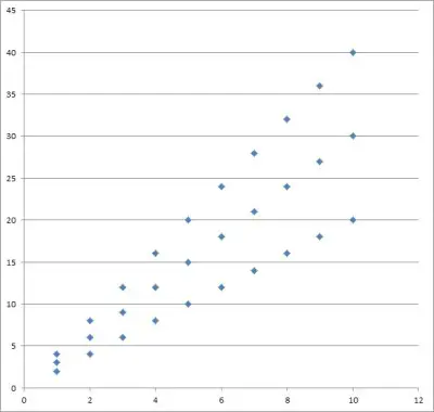
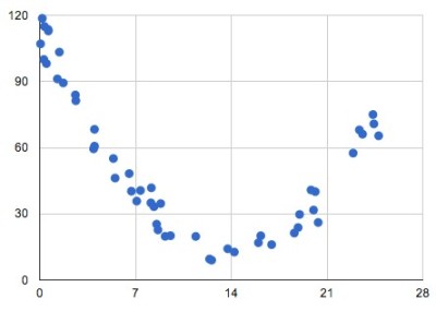
Example 2: A Nonlinear Scatter Plot
Let’s say that we have a group of people of various ages. We record the age and net worth (wealth) of each person.
When we graph the data, it does not look linear. Generally speaking, as people work and get older, their wealth increases (due to earning, saving, and investing) – to a point.
After that point (retirement age), their income decreases and they start spending down savings and investment assets.
If we split the group of people into two subgroups (pre-retirement and post-retirement), we might see two linear scatterplots (positive correlation for pre-retirement, negative correlation for post-retirement).
However, there is no guarantee that this would hold true!
Can Scatter Plots Have 3 Variables?
A scatter plot can have 3 variables. However, this is a little more difficult to visualize, since we cannot draw it on a 2-dimensional coordinate plane.
Instead, we must draw the scatter plot in 3D space. Some software can give us an idea of what the data might look like.
Another option is to graph the first two variables (call them x and y) as an ordinary scatterplot. Then, express the value of the third variable (call it z) by changing the size of the dots on the scatter plot.
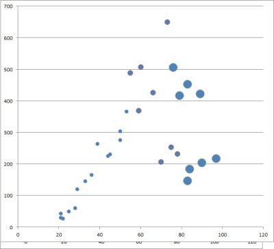
You can also use color to help with graphing, so that:
- Large red points mean a large negative value for the third variable z.
- Small red points mean a small negative value for the third variable z.
- Small green points mean a small positive value for the third variable z.
- Large green points mean a large positive value for the third variable z.
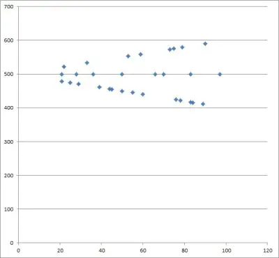
Do Scatter Plots Have To Start At Zero?
Scatter plots do not have to start at zero. Just make sure to label your axes, scales, and units clearly. Also, make note of the scale so that readers understand where you are starting from, and why.
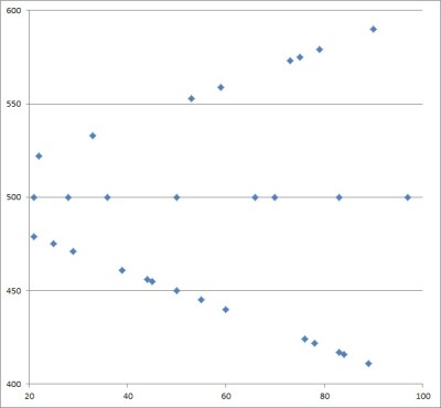
Otherwise, there will be lots of empty space on your scatter plot, as in the example below.
Do Scatter Plots Have Lines Joining The Dots?
Scatter plots do not have lines joining the dots. The dots stand alone, as each one represents a separate data point (two data points could overlap, however, so you should mention this and illustrate it somehow, if possible).
Remember that the data set for a scatter plot can be a relation that is not a function. In other words, two data points with the same x-value can have different y-values (fails the vertical line test).
This suggests that you would need to draw a vertical line on your graph. What’s more, there are multiple ways to connect the dots on such a scatter plot, which means two different people might get two different-looking graphs (a scatter plot might not be well-defined if we connect the dots).
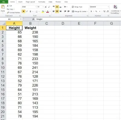
How To Make A Scatter Plot In Excel
To make a scatter plot in Excel, the first thing we need is our data. The x-values should be in the first column (on the left), and the y-values should be in the second column (on the right).
Make sure that the columns match up: they should start and end on the same row. This means that we need to have the same number of values in each column, or we cannot draw a scatter plot.
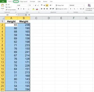
Here is an example of what our data might look like in Excel:
Once you have the data where you want it, select the entire range of cells for the scatterplot (both columns of data, excluding the header), as shown below:
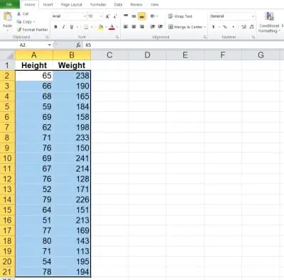
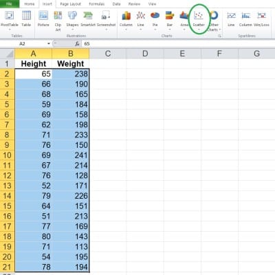
Next, click on the “Insert” tab at the top.
In the “Charts” section, click on “Scatter”.
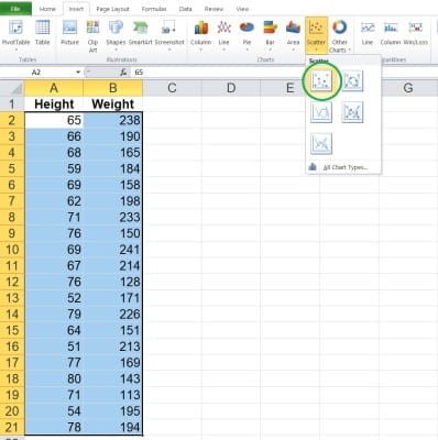
In the dropdown that appears, click on the scatter plot option without any lines (since you don’t want to connect the dots).
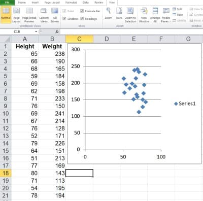
Now, you can change the scales if you want, or change the title of the graph.
Conclusion
Now you know what a scatter plot is used for. You also know the answers to some common questions about this useful mathematical tool.
You can also use a line chart to represent quantitative data.
A histogram is another way to display quantitative data – you can learn more here.
You can learn about bar graphs (and what they are used for) here.
You might also want to learn more about using a pie chart to represent qualitative data.
You can also use Excel to calculate mean – you can learn more here.
I hope you found this article helpful. If so, please share it with someone who can use the information.
Don’t forget to subscribe to our YouTube channel & get updates on new math videos!