
If you are working with a scatterplot, you are probably looking for a line of best fit as well. It helps to understand what the line of best fit is used for – that way, you can get a better grasp of the concept.
So, what is the line of best fit used for? The line of best fit is used as a rough summary to represent the data points graphed on a scatterplot. It also reveals the trend of a data set by showing the correlation between two variables. In addition, it is useful for making predictions and forecasts (interpolation or extrapolation of data).
Of course, the line of best fit does not necessarily go through every point on the scatter plot. In fact, the line of best fit may not go through any of the points on the scatter plot!
In this article, we’ll talk about what the line of best fit is used for. We’ll also answer some common questions about the line of best fit and what you should know about it.
Let’s get started.
What Is The Line Of Best Fit Used For?
The line of best fit has 3 important applications:
- 1. Summarize data from a scatterplot (use a line to give an approximate description of the relationship between the data points).
- 2. Find the trend of data (show the correlation between two variables: positive, negative, or zero).
- 3. Make predictions for data points not given (interpolation or extrapolation).
Summarizing Data On A Scatterplot With The Line Of Best Fit
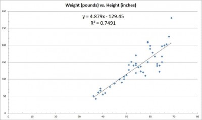
The line of best fit gives an approximate relationship between two variables, whose data is graphed on a scatterplot (like the one shown below, which depicts height in inches on the x-axis and weight in pounds on the y-axis).
You can learn more about how to draw the line of best fit for scatterplot data in this article from Carleton College.
It would be time-consuming for me to name dozens, hundreds, thousands, or even millions of data points. However, I can quickly give you the line of best fit – it is as simple as having two things:
- 1. The slope of the line of best fit (the trend, which tells us how much the y-variable changes each time the x-variable increases by 1).
- 2. The y-intercept of the line of best fit (the value of the y-variable when the x-variable is zero).
The line of best fit for a scatterplot has the usual form of a line: y = mx + ( here m is the slope and b is the y-intercept).
In the scatterplot pictured above, the line of best fit is y = 4.879x – 129.45. The slope of 4.879 tells us that for each extra inch of height a person has, he will weigh 4.879 more pounds.
For example:
- If you are 1 inch taller than me, I would expect you to weigh 4.879 more pounds than me (1*4.879 = 4.879).
- If you are 5 inches taller than me, I would expect you to weigh 24.395 more pounds than me (5*4.879 = 24.395).
- If you are 10 inches taller than me, I would expect you to weigh 48.79 more pounds than me (10*4.879 = 47.89).
Note: the line of best fit minimizes the “error” (sum of squared differences) between the line and the data points.
Finding Data Trends (Correlation) With The Line Of Best Fit
The line of best fit can also tell us about the correlation between two variables. For example, we can tell if the variables x and y have:
- Positive correlation (as x increases, y also increases).
- Negative correlation (as x increases, y decreases).
- Zero correlation (there is no clear linear relationship between the variables – in that case, the relationship might be better described by another nonlinear model).
The correlation coefficient (known as R) indicates how strong the relationship is between variables. You can learn how to use Excel to calculate the value of R in this article from the North Carolina State University.
A correlation near 1 (or -1 for negative correlation) is a very strong relationship. In fact, an R value of 1 or -1 means that we have perfect linear relationship (every data point is on the line of best fit).
On the other hand, a correlation of 0 implies that there is no discernible linear relationship between the variables. However, there may still be a different relationship (for instance: quadratic, exponential, etc.)
In the scatterplot from before (pictured again below for convenience), the correlation coefficient is R = 0.8655. This implies a fairly strong linear relationship (positive correlation) between height and weight.
That means that as height increases, weight increases as well (in other words: the taller you are, the more you weigh).
Making Predictions With The Line Of Best Fit
We can also use the line of best fit to make predictions about variables when we are missing data. There are two basic cases:
- 1. Interpolation Of Data – this means that we are making a prediction based on a data point that is between two known data points.
- 2. Extrapolation Of Data – this means that we are making a prediction based on a data point that is beyond the extent of all known data points.
Let’s look at each one of these cases in turn, starting with interpolation of data.
Interpolation Of Data Using The Line Of Best Fit
In the height vs. weight scatterplot, there is no data point for x = 42 (someone who is 42 inches tall). However, we do have data for points below x = 42 and above x = 42.
So, we can use the line of best fit to make a reasonable prediction about that person’s weight.
All we need to do is take the value x = 42 inches and substitute into the equation for the line of best fit:
y = 4.879x – 129.45 [equation for line of best fit]
y = 4.879(42) – 129.45 [substitute x = 42 inches]
y = 75.468
So, using the line of best fit, we predict that a person who is 42 inches tall will weigh 75.468 pounds. Note that this is a prediction: a person who is 42 inches tall could weigh more or less than 75.468 pounds.
However, this still gives us an idea of where the person’s weight will likely fall. To drive the point home, let’s look at an example of extrapolation of data.
Extrapolation Of Data Using The Line Of Best Fit
In the height vs. weight scatterplot, the largest x value is x = 69 inches. We do not have any data beyond this point.
So, if we want to make a prediction about the weight of a person who is x = 80 inches tall, we would need to use extrapolation.
All we need to do is take the value x = 80 inches and substitute into the equation for the line of best fit:
y = 4.879x – 129.45 [equation for line of best fit]
y = 4.879(80) – 129.45 [substitute x = 80 inches]
y = 260.87
So, using the line of best fit, we predict that a person who is 80 inches tall will weigh 260.87 pounds. Again, remember that this is a prediction: a person who is 80 inches tall could weigh more or less than 260.87 pounds.
There is lots of potential for variability in a person’s actual weight, but it is better to have an educated guess than no idea whatsoever!
Why Do We Use A Line Of Best Fit With A Graph?
We use a line of best fit with a graph to give us a sense of where the “center” of the data lies. Often (but not always), the line of best fit will separate the data into two approximately equal groups:
- 1. Data points below the line of best fit (these data points fall below our prediction).
- 2. Data points above the line of best fit (these data points come in above our prediction).
For example, look at the scatterplot of height and weight again.
There are 45 data points on the graph, and 21 of them are above the line of best fit (leaving 24 below the line of best fit).
This gives us 21/45 or about 46.7% of the data points above the line of best fit – not exactly half, but pretty close.
Some data points may lie precisely on the line of best fit. However, most data will fall above or below the line of best fit unless the data has a very strong correlation (that is, a high value of R, close to 1 or -1).
Of course, it is possible to have a single data point below the line of best fit and every other data point above the line of best fit. This is possible in the case of an extreme outlier (continuing with the height vs. weight example, consider a person who is very tall but very thin with a low body weight).
It is impossible for every data point in the scatterplot to be above the line of best fit (otherwise, it would not be the line of best fit – you could find a line that more closely models the data). Likewise, it is impossible for every data point in the scatterplot to be below the line of best fit.
How To Interpret The Line Of Best Fit
One key to help you interpret the line of best fit is to pay attention to both the units and scale on the axes of the scatterplot.
In our example from before, the x-variable has units of inches (for height). The y-variable has units of pounds (for weight).
The scale is normal here, but sometimes the scale can be thousands, millions, or even billions. Look at the axes closely to make sure you are working with the proper scale!
Once you know the units for the x and y variables, it becomes much easier to interpret the slope for the line of best fit.
We often remember slope as “rise over run”, or the change in y (rise) divided by the change in x (run). So, the slope is measured in (y-variable units) per (x variable units).
In our example, the slope is pounds per inch of height. That is, the slope tells us how much many more pounds a person weighs for each extra inch of height.
Conclusion
Now you know what the line of best fit is used for. You also know the answers to some common questions about this helpful mathematical tool.
Note: the line of best fit can also indicate that another model is more appropriate for your data. For example, if there is zero (or close to zero) correlation between two variables, a horizontal line just won’t tell us much about the relationship
If you want to know more about lines and slopes, you can learn about when lines are parallel in my article here.
I hope you found this article helpful. If so, please share it with someone who can use the information.
Don’t forget to subscribe to my YouTube channel & get updates on new math videos!
~Jonathon