
Pie charts are sometimes used to give an alternative way to visualize data. So, it helps to have a good sense of what they are and what they tell us about a data set.
So, what is a pie chart used for? A pie chart is a circular graph that displays data that is measured in one variable. It breaks out the data into categories, with each category in one sector of the chart. It is a good idea to label each sector of a pie chart with the number or percentage for the corresponding category.
Remember that a pie chart can be confusing if there are too many categories, or if there are several categories with very small percentages.
In this article, we’ll talk about what pie charts are used for. We’ll also answer some common questions about pie charts and look at some examples to make the concept clear.
Let’s get started.
What Is A Pie Chart Used For?
A pie chart gives us a visual representation of a data set. Each sector (or “slice”) on a pie chart is measured in one variable (qualitative data).
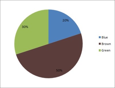
For example, if we have a group of people, we could find out the eye color for each person. Then, we could count how many people fall into each category (brown, green, or blue eyes).
The pie chart below shows this data visually.

In addition to showing frequency (count) as in the pie chart above, we can also show relative frequency (percentage), as shown in the pie chart below.
A pie chart has some important uses:
- It is an alternative way to present data (a pie chart might say more to an audience than a table).
- It compares two or more groups (categories) visually (for example, we can see if one sector is much larger than another, or if they are comparable in size).
- It shows sources for revenue, cost, or profit in business (for example, we can see which countries or states the most revenue comes from, or which products most of the revenue comes from).
One criticism of pie charts is that it may be difficult to judge the size of sectors based on angle measure.
There are some simple solutions for this problem. For example:
- Arrange the sectors in increasing size, going clockwise, with the left side of the largest sector starting at “12 o’clock” on the pie chart (in Excel, you would want to sort your data from largest to smallest before adding a pie chart).
- Label each sector with the number (count) or percentage for that category (or both).
Of course, you could use both of these methods together to make it even easier to read the pie chart. You could also find an alternative way to present the data (more on this later).
Do Pie Charts Have To Add Up To 100?
If your data is measured in percentages of a total, then the pie chart should add up to 100. However, if your data is measured in counts, then the data might not add up to 100.
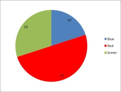
Example 1: A Pie Chart That Does Not Add Up To 100
Consider the following data set for a bag of marbles:
- 25 of them are red
- 15 of them are green
- 10 of them are blue
The total number of marbles in the bag is 25 + 15 + 10 = 50, which does not equal 100. You can see the pie chart below.
Example 2: A Pie Chart That Adds Up To 100
Consider the same data set as in the previous example. Now, we will convert to percentages (relative frequency):
- Percentage Red: 25 / 50 = 50%
- Percentage Green: 15 / 50 = 30%
- Percentage Blue: 10 / 50 = 20%
The total percentage of marbles in the bag is 50 + 30 + 20 = 100%. You can see the pie chart below.

Can Pie Charts Be More Than 100?
Pie charts can add up to more than 100 in cases where the total number of data points is greater than 100. However, the percentages should never add up to more (or less) than 100.
Remember: the sectors of a pie chart represent “parts of the whole”.
Can Pie Charts Be Used For Quantitative Data?
Pie charts are not used for quantitative data. Instead, pie charts are used for qualitative data.
For example:
- If you found the eye color (a qualitative measure) of 100 people, you could use a pie chart to display the data, since there is only one variable (eye color) and it is categorical.
- If you found the height and weight (quantitative measures) of 100 people, you cannot use a pie chart to display the data, since there are two quantitative variables.
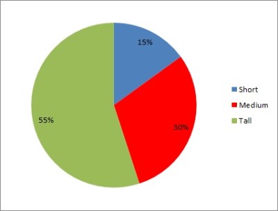
In the second case, if you focused on just one variable at a time (let’s say height) and categorized the data into “bins” or ranges of values (such as tall, medium, and short), then you could use a pie chart to represent the data.
What To Use Instead Of Pie Charts
To display quantitative data, you should consider a scatter plot or a histogram:
- A scatter plot shows a set of data points measured in two variables. It helps us to see patterns or clusters the data. A line of best fit can show us the correlation (positive, negative, or zero) between the variables.
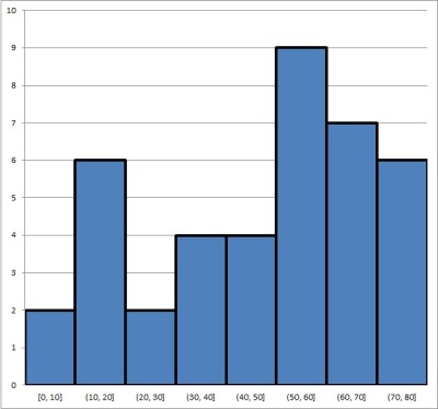
- A histogram gives a visual summary of the “spread” of data. That is, it is “a picture of the distribution of the data”. A histogram requires us to put each data point into a “bin” (range of values), count how many values are in each bin, and graph a bar of the correct height for each bin.
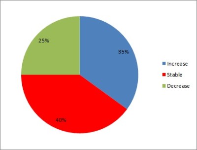
Can Pie Charts Show Negative Values?
Pie charts should not have negative values. Since the value for a sector corresponds to either a count or a percentage of a whole, they should never be negative.
However, a pie chart could certainly have one or more categories (sectors) that show a count (or percentage) of how many data points represent negative numbers.
For example, let’s say that we look at the housing market in a sample of 20 U.S. cities. We can figure out if the median home price has increased (positive percentage change), decreased (negative percentage change), or stayed the same (zero percentage change).
We would then graph these three sectors on a pie chart.
How To Make Pie Charts In Excel
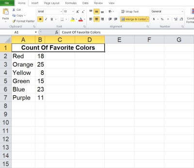
To make a pie chart in Excel, the first thing we need to do is assemble our data. The x-values (categories) should be in the first column (on the left), and the y-values (counts or percentages) should be in the second column (on the right).
Make sure that the columns match up: they should start and end on the same row. This means that we need to have the same number of values in each column, or we cannot draw a pie chart.
Here is an example of what our data might look like in Excel:
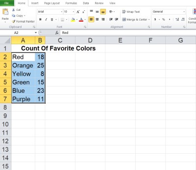
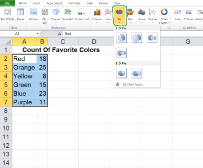
Once you have the data where you want it, select the entire range of cells for the pie chart (both columns of data, excluding the header), as shown below:
Next, click on the “Insert” tab at the top.
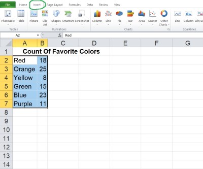
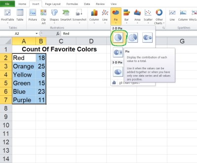
In the “Charts” section, click on “Pie”.
In the dropdown that appears, click on the pie chart option at the top left (this is the most basic one, called “Pie”).
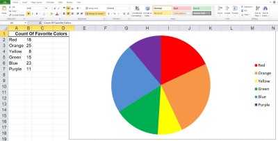
Now, you can change the colors for the sectors if you want, or change the title of the graph.
*Note: if you want relative frequencies (percentages) for each color, take the total (which is 100) and divide each count by that number to get a decimal. Convert the decimal to a percentage (move the decimal point two places to the right) and use these values for your percentages.
Conclusion
Now you know what a pie chart is used for. You also know the answers to some common questions about this useful mathematical tool.
You can learn about bar graphs (and what they are used for) here.
You can use a line chart to represent quantitative data.
You can also use Excel to calculate mean – you can learn more here.
I hope you found this article helpful. If so, please share it with someone who can use the information.

Don’t forget to subscribe to our YouTube channel & get updates on new math videos!