
Bar graphs (or bar charts) are often used in data analysis and statistics to represent a given set of values. However, this still raises the question of what exactly a bar graph tells us.
So, what does a bar graph show? A bar graph shows a visual summary of how a data set is spread out across various categories. To make a bar graph, count how many data points are in each category, and draw a bar of the proper height for each category. The bars can be vertical or horizontal, and they often have spaces between them.
In some cases, you may want to divide each category count by the total number of data points to get a relative frequency (percentage) for each range of values.
In this article, we’ll talk about bar graphs, how to draw them, and what they show. We’ll also answer some common questions about bar graphs and look at some examples.
Let’s get started.
What Is A Bar Graph Used For?
A bar graph gives us a visual representation of a data set. Each bar on a bar graph represents a count of the data points in a given category.
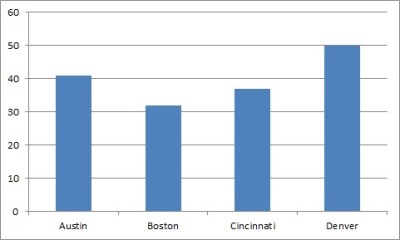
For example, if we have a group of cities, we could take the average age of the population for each city and create a bar graph with the data. The height of a bar for a city would represent the average age of a person in that city (at a particular time).
If you wish, you can also arrange the categories so that they go from highest to lowest frequency (called a Pareto chart).
A bar graph has a few important uses:
- It is an alternative way to present data (a graph might say more to an audience than a table)
- It shows patterns in data (for example, we can see how two categories compare to one another or decide which categories to investigate further).
- It can compare two or more measures for a set of categories (a grouped or clustered bar graph shows two or more bars for each category – for example, we could show average height and average weight by city).
Is A Bar Graph Horizontal Or Vertical?
A bar graph can show the bars horizontally or vertically. A bar graph with vertical bars is sometimes called a column chart.
An advantage of a vertical bar graph is when our categories are years. This allows us to graph with time on the x-axis and frequencies on the y-axis.
An advantage of a horizontal bar graph is when our categories have long names that are not numbers (for example, countries). In this case, the graph is easier to read when the category names are listed on the y-axis.
Is A Bar Graph Qualitative Or Quantitative?
A bar graph displays qualitative data. For example, we could use a bar graph to display counts for qualitative measures such as:
- Eye Color within a population (Brown, Green, Blue)
- Hair Color within a population (Black, Brown, Blond, Red)
- Crime rates by year (each year is a category)
If you want to represent quantitative data, you should use a histogram.
Is A Bar Graph Discrete Or Continuous?
A bar graph is discrete, since it is used to represent discrete data (such as number of people who have each eye color or hair color).
If you want to represent continuous data (such as heights or weights), you should use a histogram.
Can You Use Percentages In A Bar Graph?
You can use percentages in some bar graphs. For example, if the data for each category is a percentage (such as a crime rate), then the bar graph would show percentages.
Another example would be the percentage of people in each city who own a home. Each city is a category, and each category will have a percentage value, which determines the height of the vertical bar (or the length of the horizontal bar).
For a bar graph with frequencies for categories from one group (such as number of people in a city with each eye color), we can convert to percentages (relative frequencies).
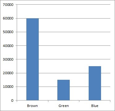
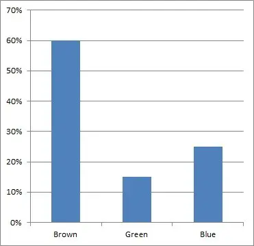
Example: Frequencies & Percentages For A Bar Graph
Let’s say that the number of people with each eye color in a city is:
- Brown = 60,000
- Green = 15,000
- Blue = 25,000
The bar graph below shows these frequencies.
Now, if we want to convert to percentages, we must divide each category value by the total number of data points. We have a total of 60,000 + 15,000 + 25,000 = 100,000 people in the city.
So, the relative frequencies (percentages) are:
- Brown = 60,000 / 100,000 = 60%
- Green = 15,000 / 100,000 = 15%
- Blue = 25,000 / 100,000 = 25%
You can see the bar graph with these frequencies below.
Can Bar Graphs Be Skewed?
A bar graph cannot be skewed in the same way that other graphs can be. The reason is that the concept of “skewed” depends on an order for the variable on the x-axis.
For example, a histogram that shows salary in dollars on the x-axis and frequencies on the y-axis will be right skewed (positively skewed), since most people have a low to moderate income, while only a few have very high incomes.
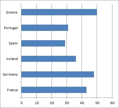
On the other hand, a bar graph that shows cities on the x-axis and population on the y-axis cannot be skewed, since there is no canonical “order” for the cities on the x-axis. For example, we could arrange the cities on the x-axis by:
- Alphabetical order (Atlanta, Boston, Cincinnati, Denver, etc.)
- Latitude
- Longitude
- Population
If we sort the cities by population (to get a Pareto chart), we would get a right-skewed (positively skewed) graph. However, if we sort in the reverse order, the graph will be left-skewed (negatively skewed),
Also, if we change to another method of sorting the cities (alphabetical order for example), the graph will look completely different.
Do Bar Graphs Have To Start At Zero?
Generally, a bar graph should start at zero on the y-axis (for a vertical or column chart). The reason has to do with the height of the bars.
One purpose of a bar graph is to compare the relative values of two or more categories at a glance. We do this by comparing heights of the bars for each category.
For example, let’s say we have two categories (A and B) that have frequencies of 90 and 100. If we start at zero on the y-axis, the bar graph would look like this:
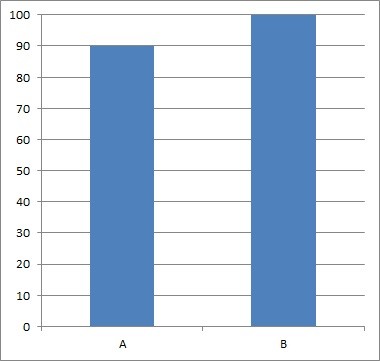
However, if we start from 80 on the y-axis, the bar graph would look like this:
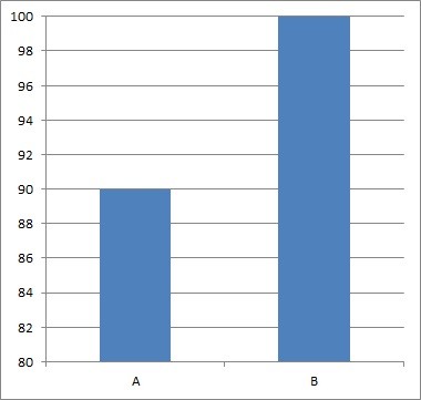
So, instead of the two bars for A and B having comparable heights (as in the first graph), the bar for B looks like it is twice as tall as the bar for A (as in the second graph). This can be misleading, especially if you don’t pay attention to the scales on the axes.
Do Bar Graphs Have Gaps?
Bar graphs have gaps between the bars. This is helpful in distinguishing them from histograms, which have no gaps between bars.
A histogram has no gaps between bars because the data is continuous. A bar graph has gaps to illustrate that the data is discrete.
Generally, each gap between bars should have the same width (just like each bar should have the same width).
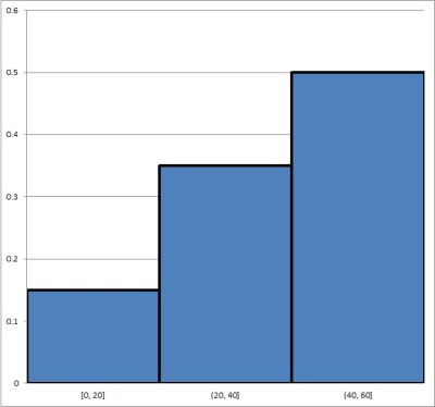
Is A Histogram The Same As A Bar Graph?
A histogram is not the same thing as a bar graph. Remember the distinction:
- A histogram is for continuous data, and it puts each data point into a “bin”, based on a range of values for each bin (for example, your bins could be people of ages 0 to 10, 11 to 20, 21 to 30, etc.). There is no space between the bars.
- A bar graph is for discrete data, and it puts each data point into a “category”, based on an attribute (for example, people who have brown eyes, blue eyes, or green eyes). There can be space between the bars.
Below, you can see an example of a histogram:
Here, we have a bar graph (bar chart):
How To Make A Bar Graph In Excel
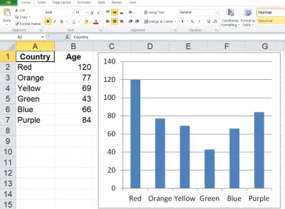
To make a bar graph in Excel, the first thing we need is our data. The x-values (categories) should be in the first column (on the left), and the y-values (frequencies) should be in the second column (on the right).
Make sure that the columns match up: they should start and end on the same row. This means that we need to have the same number of values in each column, or we cannot draw a bar graph.
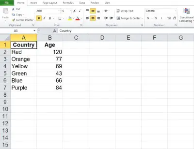
Here is an example of what our data might look like in Excel:
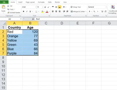
Once you have the data where you want it, select the entire range of cells for the bar graph (both columns of data, excluding the header), as shown below:
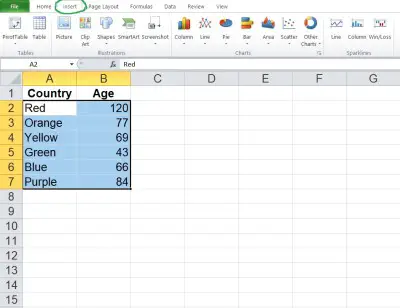
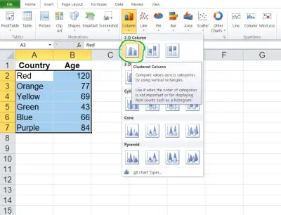
Next, click on the “Insert” tab at the top.
In the “Charts” section, click on “Bar” (for horizontal bars) or “Column” (for vertical bars). In this example, we will click “Column” to get vertical bars.
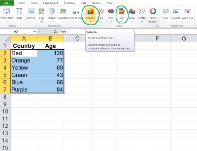
In the dropdown that appears, click on the “Clustered Bar” (for horizontal bars) or “Clustered Column” (for vertical bars) option. In this example, we will click on “Clustered Column” to get vertical bars.
Now, you can change the scales if you want, or change the title of the graph.
Conclusion
Now you know what a bar graph is, what it shows you, and how to draw one. You also know the answers to some common questions about this common and useful data visualization method.
You can learn about pie charts (another way to display data) here.
You can use a line chart to represent quantitative data.
You might also want to learn about scatter plots (for quantitative data) here.
You can also use Excel to calculate mean – you can learn more here.
I hope you found this article helpful. If so, please share it with someone who can use the information.

Don’t forget to subscribe to our YouTube channel & get updates on new math videos!