
Line charts are sometimes used in data analysis and statistics to represent a given set of values. Line charts are useful for visualizing how one variable changes with another.
So, what is a line chart used for? A line chart is used to display a set of data points that are measured in two variables. Each pair of adjacent points is connected by a line segment (or a curve). A line chart is often used to show how a variable (on the y-axis) changes over time (x-axis) – for example, distance or speed over time.
Of course, a line charts can be misleading, since the line segments imply values between data points that may not be correct.
In this article, we’ll talk about what line charts are used for. We’ll also answer some common questions about line charts and look at some examples to make the concept clear.
Let’s get started.
What Is A Line Chart Used For?
A line chart is used to give a visual representation of a data set. Each of the data points is measured in two variables (one for the x-axis and one for the y-axis).
Each point on a line graph represents a value in the data set (similar to a scatter plot). Each pair of adjacent points on a line chart is connected by a line segment (there are no line segments to connect points on a scatter plot).
A line chart is often used to show how one variable (on the y-axis) changes over time (the x-axis). For example, if we have a moving object (such as a car), we can measure its speed at various points in time.
The line chart below shows the speed of a car at intervals of 1 minute from t = 0 to t = 10.
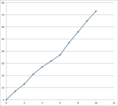
Note that the slope of the line segment from t = n to t = n + 1 gives the average acceleration over the time period [n, n+1].
A line chart has a few important uses:
- It is an alternative way to present data (a chart might say more to an audience than a table)
- It shows patterns in data (for example, we can see whether the y-variable increases, decreases, or stays the same over time, or if there is a lot of fluctuation over time).
- It can compare patterns for multiple related data sets (for example, we could show the speed of two or more cars over time, with each car having its own color for points and line segments on the chart).
Is A Line Chart Linear Or Nonlinear? (Can A Line Chart Be Curved?)
A line chart can be linear or nonlinear, depending on how you decide to connect the graphed data points.
Straight line segments suggest a linear rate of increase or decrease between two data points. However, a line chart with straight line segments has jagged “corners” (meaning the function is not differentiable).
Also, we can use a piecewise function to represent a set of straight line segments. However, this function can get quite awkward to use for a data set with hundreds or thousands of values.
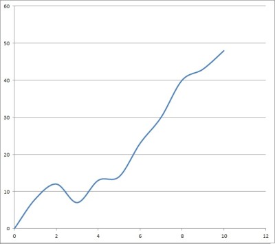
Another option is to use curves to connect the data points in a line chart. This eliminates the jagged corners in the chart, giving a smooth curve that avoids abrupt changes in direction.
Even better, in some cases we can use a polynomial function to represent all of the curves that connect the points. To find the polynomial for n data points, you would need to solve a system of n equations in n variables.
[This only applies when no two data points have the same x-value; that is, when we have a function]
When the data is not a function, we can still fit a curve to the data to minimize error.
Is A Line Chart Qualitative Or Quantitative?
A line chart is quantitative. That is, we use a line chart to represent quantitative data.
Each data point on a line chart is measured in two variables: one for the x-axis, and one for the y-axis. After we plot every point on the chart, we use line segments (or curves) to connect adjacent pairs.
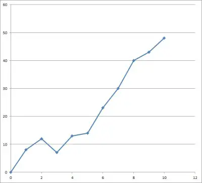
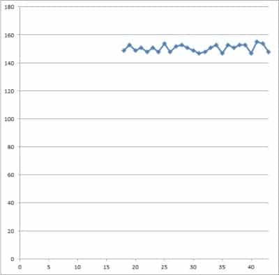
For example, let’s say we wanted to record someone’s weight every year. Each data point would measure two variables: age (x-axis) and weight (y-axis).
You can see the line chart below.
You can also represent quantitative data with a histogram.
If you want to represent qualitative data, you should try a bar graph or a pie chart.
Is A Line Chart Discrete Or Continuous?
A line chart is used to represent continuous data. The line segments or curves connecting data points suggest data values between the ones on the chart.
(If your data is discrete, you should not use a line chart).
Let’s keep going with the age and weight example from earlier.
This person has exactly one possible weight at a given point in time. Just because we didn’t measure the person at any time between year 1 and year 2 does not mean there is no data – we just don’t have it.
Similarly, if you plot something else (such as revenue over time), there is still data in between each plotted point. We may not have a measurement, but it is still there.
Is A Line Chart A Polynomial Function?
A line chart is not always a polynomial function.
If you use line segments to connect adjacent pairs of points in a line chart, then you would need a piecewise function with the equations of lines to describe the graph.
If you use curves to connect adjacent pairs of points in a line chart, then you can use a polynomial function in some cases to describe the graph.
You can use Excel to fit a polynomial to data (more on this later).
Can A Line Chart Not Start At Zero?
Line charts do not have to start at zero. The point of a line chart is to show trends over time (increases, decreases, etc.), which we can see whether the line chart starts at zero or not.
Just make sure to label your axes, scales, and units clearly. Also, make note of the scale so that readers understand where you are starting from, and why.
Otherwise, there will be lots of empty space on your scatter plot, as in the example below.
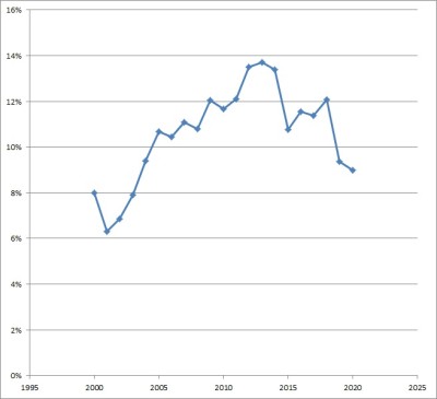
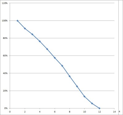
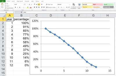
Can You Have Percentages In A Line Chart?
You can have percentages in a line chart. For example, if you are graphing unemployment rate (expressed as a percentage) over time, then you will have to use percentages in the line chart.
If a line chart is showing an increase towards a final total (or a decrease from an initial total), you could also convert to a chart with percentages.
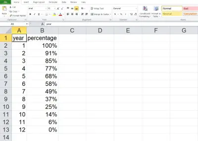
For example, consider the line chart below, which shows inventory remaining at a warehouse over time (in days).
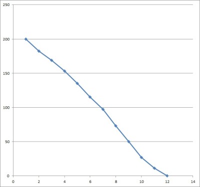
If we take the starting value of 200 and divide the y-value of each data point by 200, we can get percentages that tell us how much of the original amount is left.
Can A Histogram Be A Line Chart?
A histogram cannot be a line chart, since:
- A histogram uses “bins” (ranges of values) to group individual data points into categories.
- A line chart plots individual data points and connects adjacent pairs of points with line segments or curves.
Do You Connect The Dots On A Line Chart?
You must connect the dots on a line chart, either with line segments or curves. Otherwise, you don’t have a line segment, but rather a scatter plot.
How To Make A Line Chart In Excel
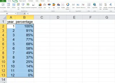
To make a line chart in Excel, the first thing we need is our data. The x-values should be in the first column (on the left), and the y-values should be in the second column (on the right).
Make sure that the columns match up: they should start and end on the same row. This means that we need to have the same number of values in each column, or we cannot draw a scatter plot.
Here is an example of what our data might look like in Excel:
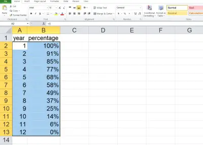
Once you have the data where you want it, select the entire range of cells for the line chart (both columns of data, excluding the header), as shown below:
Next, click on the “Insert” tab at the top.
In the “Charts” section, click on “Scatter”.
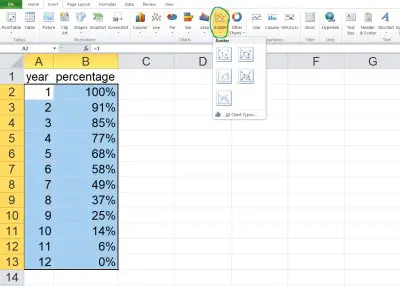
In the dropdown that appears, click on the scatter plot option with straight lines (if you want curves, select the scatter option with smooth lines just to the left of it).

Now, you can change the scales if you want, or change the title of the graph.
How To Fit A Polynomial To Data In Excel
Sometimes, you would rather use a curve (such as a polynomial) instead of line segments to connect your data points. Here is how to do it.
First, create a scatter plot, as above.
Next, right-click on one of the data points to get a context menu. Select the “Add Trendline…” option.
Then, select the “Polynomial” button. To the right, choose an order that is one less than the number of data points.
Here, I have 12 data points, so I would like an order of 12 – 1 = 11. However, the maximum allowed is 6, so I choose that.
Finally, check the “Display Equation on chart” checkbox at the bottom. That way, you will know the equation for your polynomial.
Conclusion
Now you know what a line chart is used for. You also know the answers to some common questions about this useful mathematical tool.
You can also use Excel to calculate mean – you can learn more here.
I hope you found this article helpful. If so, please share it with someone who can use the information.

Don’t forget to subscribe to our YouTube channel & get updates on new math videos!