
Histograms are often used in data analysis and statistics to represent a given set of values. However, this still raises the question of what exactly a histogram tells us.
So, what does a histogram show? A histogram shows a visual summary of how a data set is spread out. In other words, it is “a picture of the distribution of the data”. To make a histogram, put each data point into a “bin” (range of values), count how many values are in each bin, and draw a bar of the proper height for each bin.
If you wish, you can also divide each bin count by the total number of data points to get a relative frequency (percentage) for each range of values.
In this article, we’ll talk about histograms, how to draw them, and what they show. We’ll also answer some common questions about histograms and look at some examples.
Let’s get started.
What Does A Histogram Show?
A histogram shows us a picture of the distribution for a continuous data set (quantitative data). It can give us an idea of the center and spread of the data (for example, mean and standard deviation).
A histogram shows us how often data points fall into each of the “bins” that we define (this is known as frequency). However, the picture we get in a histogram is highly dependent on the “bins” (ranges of values) that we choose for our histogram.
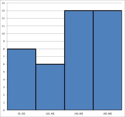
For example, below are two different histograms (with different bins) for the same data set.
The first histogram has 4 bins, each with a width of 20. It looks like this:
The second histogram has 8 bins, each with a width of 10. It looks like this:
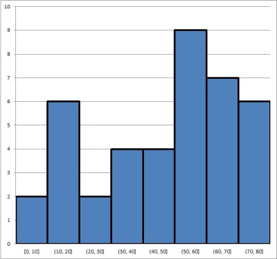
Can you see how you might draw different conclusions about the same data set, based on the two histograms above? This shows why it is important to choose bins carefully and know your scale when analyzing a histogram.
How Do You Find Relative Frequency In A Histogram?
Remember that a histogram can show either:
- Frequency (the number of data points in each bin), or
- Relative Frequency (the percentage of data points in each bin)
To switch from frequency to relative frequency, all you need to do is divide the frequency in each bin by the total number of points in the data set.
For example, let’s you have three bins for the variable X as follows:
- First bin: 15 data points in the range 0 <= X <= 20
- Second bin: 35 data points in the range 20 < X <= 40
- Third bin: 50 data points in the range 40 < X <= 60
The corresponding histogram looks like this:
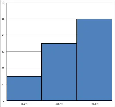
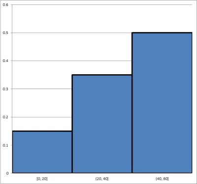
There are a total of 100 data points in the set (15 + 35 + 50 = 100). To convert to relative frequency, we divide each frequency by the number of data points (100) to get 15/100, 35/100, and 50/100, or 15%, 35%, and 50%:
- First bin: 15% of data points in the range 0 <= X <= 20
- Second bin: 35% data points in the range 20 < X <= 40
- Third bin: 50% data points in the range 40 < X <= 60
The histogram below shows the same data set, but with relative frequency (instead of frequency):
How To Choose Bin Sizes For A Histogram
Usually (but not always), the bin sizes for a histogram have the same size (or width). For example, the following bins each have width of 20:
- First bin: 0 <= X <= 20 (width of 20 – 0 = 20)
- Second bin: 20 < X <= 40 (width of 40 – 20 = 20)
- Third bin: 40 < X <= 60 (width of 60 – 40 = 20)
The optimal bin size S and number of bins B for a histogram depends on the data set. Some possible methods you can use include:
- B = √N (rounded). So if N = 100, you would use B = √N = √100 = 10 bins.
- B = 23√N (rounded). So if N = 1000, you would use B = 23√N = 23√1000 = 2*10 = 20 bins.
where N is the number of points in the data set.
After you decide on the number of bins B, you can get bins with equal width by choosing a bin size S as:
- S = (M – m) / B
where M is the maximum value in the data set and m is the minimum value in the data set.
However, choosing bin sizes for a histogram requires some careful thought. After all:
- If you make your bins too wide, you will have very few bins. In that case, the histogram may hide some of the detail (which obscures insight you could get from the data).
- If you make your bins too narrow, you will have lots of bins – possibly too many. In that case, the histogram will be difficult to read.
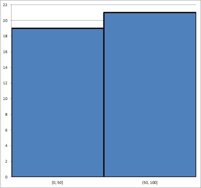
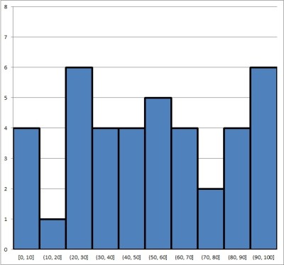
As an extreme example, consider the following two histograms for the same data set.
The first histogram has only two bins, each with a width of 50: 0 <= X <= 50 and 50 < X <= 100. You can see it below:
The second histogram has 10 bins, each of width 10: 0 <= X <= 10, 10 < x <= 20, etc. You can see it below:
The first histogram might be useful for splitting the group into two halves (those at or below 50 and those above 50).
However, the second histogram gives us a lot more granularity and more insight into the data. It may also help us to ask better questions.
For example, why is the frequency for the interval (10, 20] so low compared to the others, and why is the frequency for the interval (20, 30] is so high?
Is A Histogram Qualitative Or Quantitative?
A histogram is used to represent quantitative data. It works by splitting the data into “bins” or groups defined by a range of values (an interval).
For instance, if we poll a group of people for their age, we can use bins of “decades”:
- First bin: people 10 years old or younger.
- Second bin: people 20 years old or younger who are not in the first bin
- Third bin: people 30 years old or younger who are not in the first or second bin.
- etc.
If you want to represent qualitative data (such as eye color), you should use a bar graph (bar chart).
Is a Histogram Discrete Or Continuous?
A histogram is used to represent continuous data. Let’s keep going with the age example from earlier: each person has a certain age (6.5 years, 12 years, 18.25 years, etc.), and the ages of a group of people gives us a continuous data set.
If you want to represent discrete data (such as the number of students in each classroom in a school), you should use a bar graph (bar chart).
Can A Histogram Have Gaps?
A histogram cannot have gaps between the vertical columns. By definition, a histogram is used to represent continuous data, so there should be no gaps between the bins (ranges of values).
A bar graph can have gaps between the vertical columns. In fact, leaving gaps between vertical columns in a bar graph is helpful to show the difference between a histogram and a bar graph.
Is A Histogram A Bar Graph?
A histogram is not the same thing as a bar graph. Remember the distinction:
- A histogram is for continuous data, and it puts each data point into a “bin”, based on a range of values for each bin (for example, your bins could be people of ages 0 to 10, 11 to 20, 21 to 30, etc.). There is no space between the horizontal bars.
- A bar graph is for discrete data, and it puts each data point into a “category”, based on an attribute (for example, people who have brown eyes, blue eyes, or green eyes). There can be space between the horizontal bars (or not).
Below, you can see an example of a histogram:
Here, we have a bar graph (bar chart):
Can You Find Median From A Histogram?
You can get an idea of where the median lies by using a histogram (either with frequency or relative frequency.
Example 1: Finding The Median From A Histogram With Frequency
Consider the following histogram with frequencies shown:
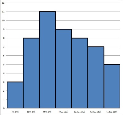
Adding up the frequencies for all bins, we find that there are 51 points in the data set. So, the median value will be the one where 25 values are above it and 25 values are below it.
- Looking at the first bin, we see that there are 3 data points in it.
- Looking at the second bin, we see that there are 8 data points in it.
- Looking at the third bin, we see that there are 11 data points in it.
- Looking at the fourth bin, we see that there are 9 data points in it.
So, the median must be somewhere in the fourth bin (it cannot be in the third bin since, there would be at most 22 data points at or below any number in that range).
Thus, the median has a value somewhere between 90 and 120.
To find the exact value, we would need to arrange all 51 values in the data set from smallest to largest and pick the 26th one (the middle or median).
Example 2: Finding The Median From A Histogram With Relative Frequency
Consider the following histogram with relative frequencies shown:
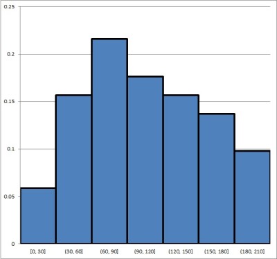
Remember that the median is also the 50th percentile of a data set. That is, the median is the value where 50% of data points are below it and 50% of data points are above it.
- Looking at the first bin, we see that it contains about 6% of the data points.
- Looking at the first bin, we see that it contains about 16% of the data points.
- Looking at the first bin, we see that it contains about 22% of the data points.
- Looking at the first bin, we see that it contains about 18% of the data points.
So, the median must be somewhere in the fourth bin (if it were in the third bin, there would be at most 44% of the data points below it).
Thus, the median has a value somewhere between 90 and 120.
To find the exact value, we would need to arrange all 51 values in the data set from smallest to largest and pick the 26th one (the middle or median).
Can You Find Mean From A Histogram?
You can get an idea of the mean from a histogram. However, to find the exact value M of the mean, you would need to look at the original data points and use the formula:
- M = S/N
where
- S is the sum of the values of all data points in the set
- N is the number of data points in the set
We can find the value of N from a histogram with frequencies – all we need to do is add up all of the frequencies.
Finding the exact value of S with confidence, without the original data set, is not possible. However, we can estimate S as follows:
- 1. For each bin, take the value in the middle of the range of values.
- 2. Multiply the value from 1. by the frequency for that bin.
- 3. Add up all of the products from 2.
This will give you an estimate for the value of S (the sum of all data points). Then, you would divide by N to get an estimate for the mean M.
Example: Estimating The Mean From A Histogram With Frequencies
Consider the following histogram with frequencies shown:
Adding up the frequencies for all bins, we find that there are N = 51 points in the data set.
The following table shows the “middle” value for each bin (the midpoint of the interval), the frequency (taken from the histogram), and the product of the middle value and the frequency:
| Bin | Mid | Freq | Prod |
|---|---|---|---|
| [0,30] | 15 | 3 | 45 |
| (30,60] | 45 | 8 | 360 |
| (60,90] | 75 | 11 | 825 |
| (90,120] | 105 | 9 | 945 |
| (120,150] | 135 | 8 | 1080 |
| (150,180] | 165 | 7 | 1155 |
| (180,210] | 195 | 5 | 975 |
and the product of the two values for
each bin (interval) in the histogram above.
Adding up the products in the third column, we get a value of S = 5385 as our estimate for the sum of all values in the data set.
Dividing by N = 51, we get M = 5385/51 = 105.59 as our estimate for the mean of the data set. This looks to be around the “center” of the data set, and there don’t seem to be any outliers, so this is probably a reasonable estimate for the mean.
Conclusion
Now you know what a histogram is, what it shows you, and how to draw one. You also know the answers to some common questions about this common and useful data visualization method.
You can also use a line chart to represent quantitative data.
You might also want to learn more about using a pie chart to represent qualitative data.
I hope you found this article helpful. If so, please share it with someone who can use the information.

Don’t forget to subscribe to our YouTube channel & get updates on new math videos!