
Mr. Jackson, a history teacher at Middletown High School, teaches two classes of College Prep United States History. Each class has 20 students. After a particularly difficult test, he presents a slide with the following data:
| Statistic | Class A | Class B |
| Mean | 75 | 75 |
| Median | 75 | 77.5 |
| Standard Deviation | 9.87 | 14.2 |
the results of a test, but
not every individual grade.
Effectively, Mr. Jackson has given us a snapshot of the test results. While we don’t know the actual grades students earned on the test, we can get an overall picture of how students did on the tests in each class.

The mean, median and standard deviation are examples of descriptive statistics. In this article we’re going to look more closely at descriptive statistics. So let’s get started.
Two Types Of Descriptive Statistics
Descriptive statistics fall into two categories: measures of central tendency and measures of variability.
Measures of Central Tendency
A measure of central tendency is a single value that attempts to describe a set of data by identifying the central position within that set of data. You’re likely familiar with the mean of a set of data.
Mean: The mean of a data set is the average of the numbers. To find the mean, add the numbers in the set and divide by the number of numbers.
(You can learn about some uses of mean here).
Median: When arranged in ascending or descending order, the median of a data set is the middle number. If there are an even number of items in the data set, the median is the mean of the two middle numbers.
(You can learn about some uses of median here).
Mode: The mode of a data set is the number that appears most often. It’s possible that a data set has no mode and it’s possible that a data set has more than one mode.
(You can learn how to calculate the mode in Excel here.)
Let’s look at an example of these descriptive statistics.
Example
On a main road with a posted speed limit of 35 miles per hour, a police officer with a radar gun recorded the following speeds (in mph) of 15 cars traveling past him:
- {35, 38, 41, 25, 42, 44, 38, 50, 41, 29, 44, 35, 37, 41, 40}
Find the mean, median and mode of the cars’ speeds.
Solution:
First, let’s find the mean of the data set. This is easy enough – we simply add the numbers and divide by 15, the total number of items in the set:
- (35 + 38 + 41 + 25 + 42 + 44 + 38 + 50 + 41 + 29 + 44 + 35 + 37 + 41 + 40)/15
- =580/15
- =38.66667
Rounded to the nearest tenth, the mean of the speeds is 38.7 mph.
Now, let’s find the median of the speeds. We need to arrange the numbers in either ascending or descending order. Be sure to double check the list once we have reordered it – if we’re doing the work by hand, it can be easy to miss a number.
- {25, 29, 35, 35, 37, 38, 38, 40, 41, 41, 41, 42, 44, 44, 50}
Since there are 15 numbers, the middle number is the 8th number on the list. In this case, the median is 40 mph.
To determine the mode, we simply find which number occurs the most. Since we already have the numbers in increasing order, it’s easy to see that the mode of the speeds is 41 mph. Notice that the mean, median, and mode are all over the posted speed limit of 35 mph. Interesting!
Measures of Variability
Across the hall from Mr. Jackson, Ms. Cook teaches two Honors Precalculus Classes – Class A and Class B. Each of these classes has 20 students.
After the most recent exam, Ms. Cook graded the exams but hasn’t handed them back. She tells her students that the mean of the test scores for each of the two classes was the same: 75%. Coincidence aside, let’s think about this a bit.
The mean of the test scores tells us some information but not a lot. The class means (averages) were the same for both classes. But, the mean doesn’t tell us how these grades are spread out.
When pressed for more information from her students, Ms. Cook decides to tell the class the actual grades (without naming names!)
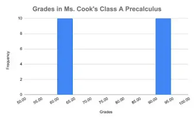
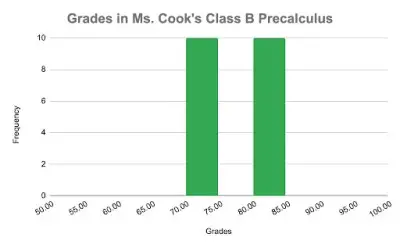
In Class A, 10 students scored 60% and 10 students scored 90% on the test. In Class B, 10 students scored 70% and 10 students scored 80%.
For both classes, the average test grade is 75% but the dispersion of the grades is vastly different for the two classes! In Class A, the grades are far from the mean but in Class B, the grades are clustered around the mean.
Even though the mean is the same for both classes, the grades are very different! Which class would you prefer to be in?
Measures of Variability tell us how spread out the data is. To visualize the differences between the two classes’ grades, look at these histograms.
Notice how spread out the grades are in Class A. The grades in Class B are much closer to the mean of 75%.
We can use descriptive statistics to help us quantify the differences in spread. This is where variance and standard deviation come in.
Variance: The variance, denoted 𝜎2, measures how far a data set is spread out. It is mathematically defined as the average of the squared differences from the mean. What was that again? By hand, calculating the variance of a data set is a tedious task. Fortunately, calculators and computers can do the hard work for us.
Standard deviation: The standard deviation of a data set, denoted by 𝜎, is the square root of the variance. In practice, both the variance and the standard deviation measure the spread of the data. The standard deviation is used more frequently and provides a better idea of how the data is dispersed around the center.
(You can learn about some uses of standard deviation here).
If we look back at Mr. Jackson’s history classes, notice that the means of the two classes’ test grades are the same but the standard deviation is greater for Class B. This indicates that the grades in Class B had greater variability; that is, the grades were more spread out.
Let’s look at another measure of variability – the range.
Range: The range is the difference between the maximum value and the minimum value in a data set. In our police officer radar gun example, the maximum value is 50 mph and the minimum value is 25 mph. The range is equal to 50 – 25 = 25.
Quartiles are also useful measures of variability. Quartiles are 3 values that split our sorted data into four equal parts.
First Quartile (Q1) – the number that is halfway between the minimum value and the median in a sorted list of the data. The first quartile is also the 25th percentile of the data. That is, 25% of the data falls below the first quartile. Q1 is sometimes called the lower quartile.
Second Quartile (Q2) – this is the same as the median of the data. It is the middle number of the sorted data. The second quartile is also the 50th percentile of the data. That is, 50% of the data falls below the second quartile.
Third Quartile (Q3) – the number that is halfway between the median and the maximum value in a sorted list. The third quartile is the 75th percentile of the data. That is, 75% of the data falls below the third quartile. Q3 is sometimes called the upper quartile.
(You can learn how to find quartiles in Excel here).
Reference: quartiles
Example
Priya is selling collectible action figures online. This past week, she made 17 sales. Priya recorded the sales prices (in dollars) as follows:
- {15, 11, 25, 31, 18, 19, 45, 24, 35, 38, 41, 52, 16, 60, 40, 22, 27}
Find the three quartiles.
Solution:
First we need to sort the data into either ascending or descending order. In ascending order, the data looks like this:
- {11, 15, 16, 18, 19, 22, 24, 25, 27, 31, 35, 38, 40, 41, 45, 52, 60}
We’ll start by finding the median. We have 17 numbers so the middle number is the 9th value or 27.
- {11, 15, 16, 18, 19, 22, 24, 25, 27, 31, 35, 38, 40, 41, 45, 52, 60}
To determine the first quartile Q1, we need to find the middle number of the first half of data, not including the median. In other words, we’ll find the middle number of the data between 11 and 25.
- {11, 15, 16, 18, 19, 22, 24, 25}
In this case, there are two middle numbers: 18 and 19. So we take the average of the two numbers:
- Q1 = (18 + 19)/2
- Q1 = 18.5
So, the first quartile is 18.5.
Similarly, to find the third quartile Q3, we need to find the middle number of the second half of the data.
- {31, 35, 38, 40, 41, 45, 52, 60}
Once again, there are two middle numbers: 40 and 41. Averaging the two, we get Q3 = 40.5. The third quartile is 40.5.
An often discussed statistic is the Interquartile Range or IQR. The IQR is the range of the middle 50% of the data. We can calculate it by subtracting Q3 minus Q1:
- IQR = Q3 – Q1
So in our example, the IQR of the sales prices of the action figures is equal to 40.5 – 18.5 = 22.
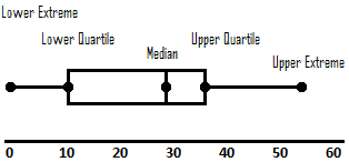
A box and whisker plot is a pretty cool way to display 5 descriptive statistics.
Here is a box and whisker plot for Priya’s action figures sales:
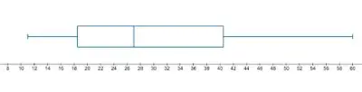
The rectangle is displaying the middle 50% of the data, with the vertical line in the center representing the median of the data. The left side of the rectangle is Q1, the right side of the rectangle is Q3.
The “whiskers” are the horizontal segments on either side of the rectangle. The minimum value is the endpoint of the left whisker and the maximum value is the right endpoint of the whisker.
Box and whisker plots give a very quick visual of the minimum, maximum, Q1, the median, and Q3.
It turns out that colleges often report the middle 50% of test scores and high school GPAs. Let’s take a look.
UMass Amherst reports the following statistics for the freshman class that entered in 2021:
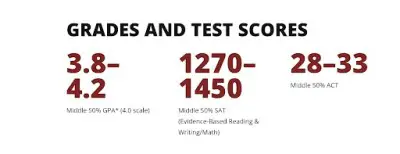
Notice that for each of the three categories: GPA, SAT scores, and ACT scores, UMass reports the middle 50% of the grades/scores.
Let’s calculate the IQR of the SAT scores at UMass.
- IQR = Q3 – Q1
In this case, Q3 = 1450 and Q1 = 1270 so we have:
- IQR = 1450 – 1270
- IQR = 180
What does this mean? Of those students who reported their SAT results, the interquartile range is 180 points. It’s worth noting that UMass Amherst is a test optional school so these numbers are only for those students who reported SAT scores.
Finding the variance and standard deviation by hand is time consuming and tedious. In practice, these statistics would rarely be calculated by hand. It is relatively easy to find descriptive statistics using the TI-84 Plus.

For our speeding problem involving the police officer, let’s calculate the statistics using the TI-84.
First, we can enter the data into the calculator: press , then select EDIT, (option 1), and press
.
Now, enter the data into an empty column on screen. If none of your columns are empty, use the arrow key to highlight the column title, then and arrow back down into the column.
Once you’ve finished entering the data into that column, double check that you have 15 data entries. Also, make a mental note as to which column you stored the data.
Now, we’re ready to calculate the statistics!!! Select again, only this time, right arrow to CALC then choose Option 1: 1-Var Stats.
For List: type in the column name. We don’t have a frequency column, so we can leave FreqList blank. Arrow down to highlight “Calculate” then press .
And there you have it! You’ll see a list of data. Now we just need to interpret the data.
The first item on the list, x̅, is the mean of the data, which should match our calculation above: 39.7, rounded.
The median of the data will show up if you scroll to the next page: Med = 40, which is also correct.
The calculator doesn’t automatically give us the Mode of the data, but we can easily find this by sorting the data: Choose , then arrow down to Option 2: SortA( then type in the column name again), and select
.
The calculator should say “Done.” Now go back into the column of data and it should be sorted! From this, we can see that the mode is 41.
What about all the other data the calculator gives you? Well, as mentioned earlier, the calculator will also give us the standard deviation 𝜎x = 5.92 (rounded).
It also gives the first and third quartiles as well as other information we may or may not need: minX = 25, Q1 = 35, Q3 = 42, maxX = 50. Pretty good work for our calculator!
As we’ve seen, descriptive statistics are super helpful in getting a sense of how a large set of data is dispersed. The statistics help us visualize the data and interpret what is really going on with the numbers.
Some statistics are resistant to outliers, while others are not – you can learn more here.
I hope you found this article helpful. If so, please share it with someone who can use the information.

Don’t forget to subscribe to our YouTube channel & get updates on new math videos!
About the author:
Jean-Marie Gard is an independent math teacher and tutor based in Massachusetts. You can get in touch with Jean-Marie at https://testpreptoday.com/.